PushButton
__init__(
    self,
    master,
    command=None,
    args=None,
    text="Button",
    image=None,
    pady=10,
    padx=10,
    grid=None,
    align=None,
    icon=None,
    visible=True,
    enabled=None,
    width=None,
    height=None)
What is it?
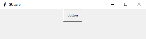
The PushButton object displays a button with text or an image, which calls a function when pressed.
How do I make one?
Create a PushButton object like this:
from guizero import App, PushButton
def do_nothing():
    print("Button was pressed")

app = App()
button = PushButton(app, command=do_nothing)
app.display()
Create a picture PushButton with an image like this:
from guizero import App, PushButton
def do_nothing():
    print("A picture button was pressed")

app = App()
button = PushButton(app, image="button.gif", command=do_nothing)
app.display()
Depending on your operating system and whether you installed the guizero additional image features will determine what image types you can use for PushButton. By default GIF and PNG are supported, except macOS which only supports GIF.
Starting parameters
When you create a PushButton object you must specify master and you can specify any of the optional parameters. Specify parameters in the brackets, like this: button = PushButton(app)
| Parameter | Takes | Default | Compulsory | Description |
|---|---|---|---|---|
| master | App, Window or Box | - | Yes | The container to which this widget belongs |
| command | function name | None | - | The name of a function to call when the button is pressed. |
| align | string | None | - | Alignment of this widget within its container. Possible values: "top", "bottom", "left", "right". |
| args | list | None | - | If you wish to pass any arguments to the function specified in the command parameter, you can specify them as a list |
| grid | List [int, int] | None | - | [x,y] coordinates of this widget. This parameter is only required if the master object has a grid layout. |
| image | string | None | - | The file path, tkinter.PhotoImage or PIL.Image you wish to display. If both an image and text are specified, the image will override the text. |
| padx | int | 10 | - | How much horizontal padding to add between the text/icon and the edge of the button. |
| pady | int | 10 | - | How much vertical padding to add between the text/icon and the edge of the button. |
| text | string | "Button" | - | The text to display on the button |
| visible | boolean | True | No | If the widget should be visible. |
| enabled | boolean | None | No | If the widget should be enabled. If None (the default) the enabled property will be inherited from the master |
| width | size | None | No | Set the width of the widget in characters or pixels if its an image button or to "fill" |
| height | size | None | No | Set the height of the widget in characters or pixels if its an image button or to "fill" |
Methods
You can call the following methods on a PushButton object.
| Method | Takes | Returns | Description |
|---|---|---|---|
| after(time, command, args=None) | time (int), command (function name), args (list of arguments) | - | Schedules a single call to command after time milliseconds. (To repeatedly call the same command, use repeat()) |
| cancel(command) | command (function name) | - | Cancels a scheduled call to command |
| destroy() | - | - | Destroys the widget |
| disable() | - | - | Disables the widget so that it is "greyed out" and cannot be interacted with |
| enable() | - | - | Enables the widget |
| focus() | - | - | Gives focus to the widget |
| hide() | - | - | Hides the widget from view. This method will unpack the widget from the layout manager. |
| padding(padx, pady) | padx (int), pady(int) | - | Sets the amount of x (horizontal) and y (vertical) padding between the text/icon and the edge of the button |
| repeat(time, command, args=None) | time (int), command (function name), args (list of arguments) | - | Repeats command every time milliseconds. This is useful for scheduling a function to be regularly called, for example updating a value read from a sensor. |
| resize(width, height) | width (int), height (int) | - | Sets the width and height of the widget |
| show() | - | - | Displays the widget if it was previously hidden |
| toggle() | - | - | Changes the state of the button to the opposite of its current state - if it is currently enabled, disable it and vice versa. |
| update_command(command, args =None) | command (function name), args (Optional List of arguments to be passed to command) | - | Updates the function to call when the button is pressed . |
Properties
You can set and get the following properties:
| Method | Data type | Description |
|---|---|---|
| align | string | The alignment of this widget within its container |
| bg | color | The background colour of the widget |
| enabled | boolean | True if the widget is enabled |
| font | string | The font of the text on the button |
| grid | List | [x,y] coordinates of this widget. This parameter is only required if the master object has a grid |
| height | size | Set the height of the widget in characters or pixels if its an image button or to "fill" |
| image | image_source (string) | The file path, tkinter.PhotoImage or PIL.Image you wish to display. |
| master | App or Box | The container to which this widget belongs |
| text | string | The text on the button |
| text_color | color | The colour of the text on the button |
| text_size | int | The size of the text on the button |
| text_bold | boolean | Whether the text is bold |
| text_italic | boolean | Whether the text is italic |
| text_underline | boolean | Whether the text is underlined |
| text_overstrike | boolean | Whether the text is overstruck |
| tk | tkinter.Button | The internal tkinter object, see Using tkinter |
| value | int | Returns 1 when the button is pressed, 0 if the button is released |
| visible | boolean | If this widget is visible |
| width | size | Set the width of the widget in characters or pixels if its an image button or to "fill" |
Refer to a property as <name of widget>.property. For example, if your PushButton object is called button you would write button.value.
You can set the property (for example button.bg = "red") or get the value of the property to use (for example print(button.bg)).